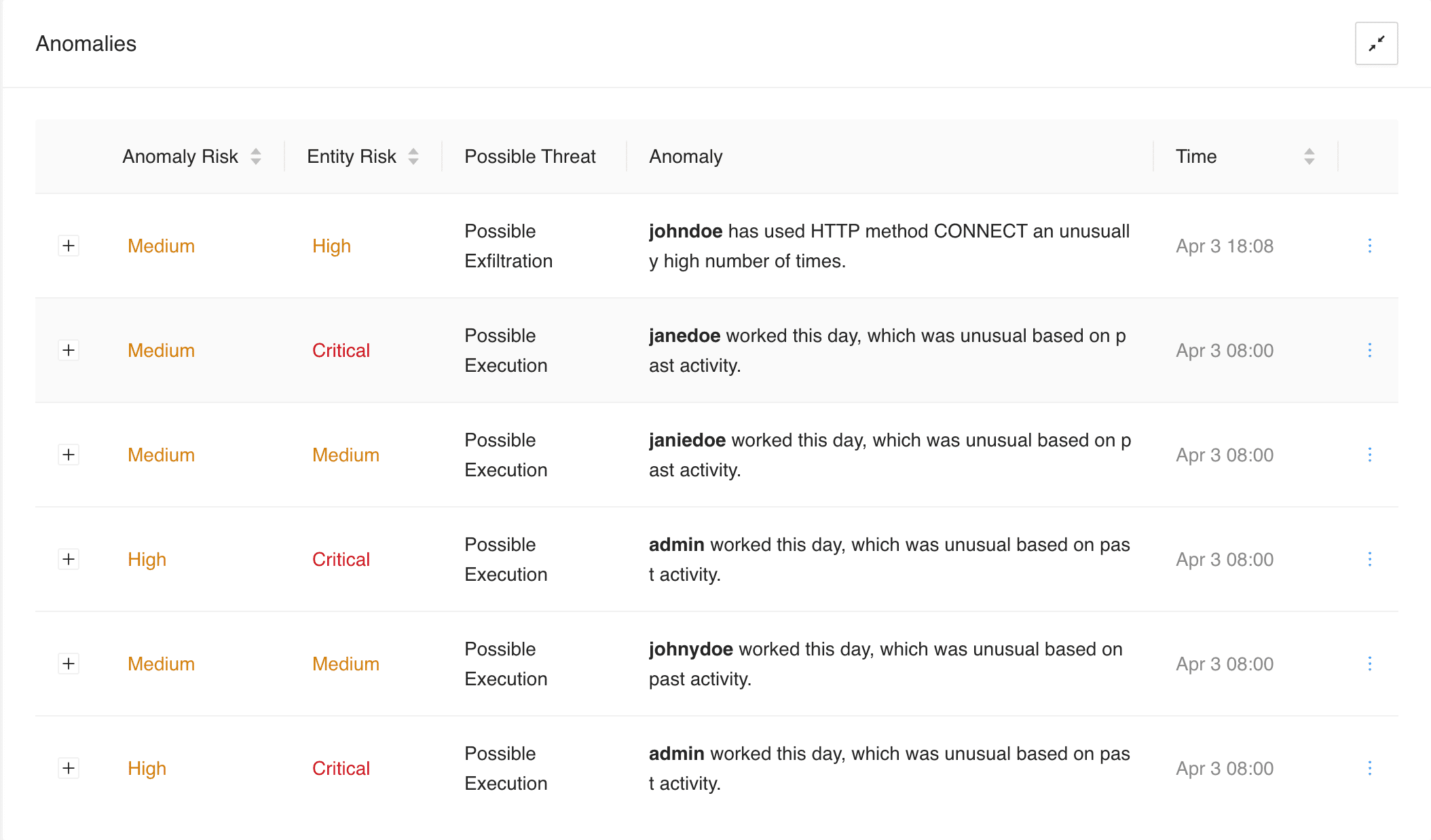
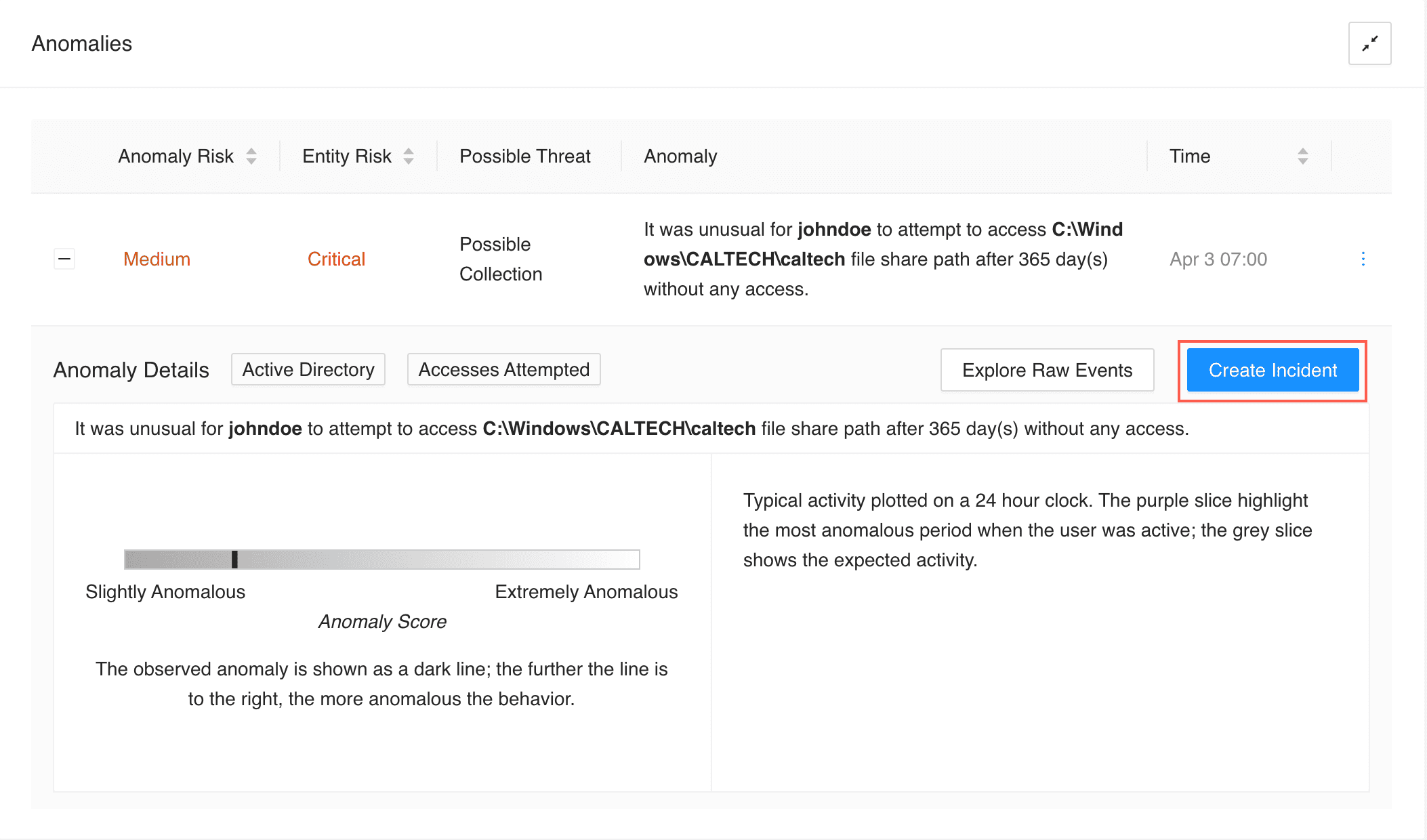
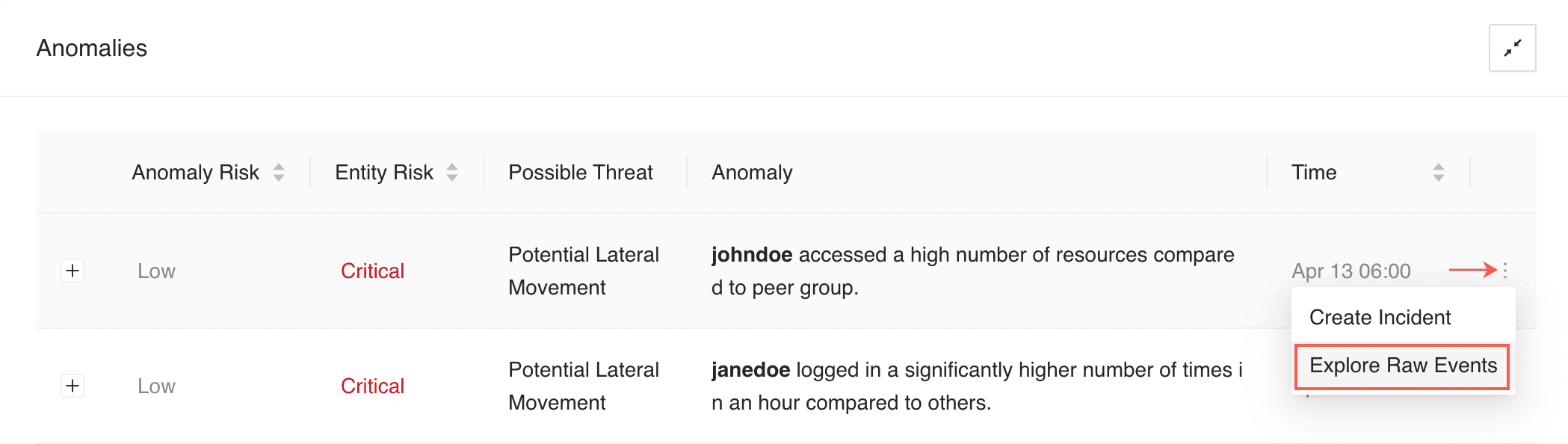
Anomalies panel lists all the suspicious activities detected by the analytics in your system. Each anomaly has an anomaly risk level, entity risk level, possible threat type, anomaly description, and time when the anomaly was created. The anomaly and entity risk levels are color-coded according to the Risk Scores.
In Anomalies, you can:
Sort the Anomaly Risk, Entity Risk, and Time columns. You can only sort one column at a time. When you sort the column, only the anomalies already listed in the panel are sorted. Once you scroll to load more anomalies, the sorting is reset.
Filter the data based on the individual entity by clicking the highlighted entity’s name in the Anomaly column.
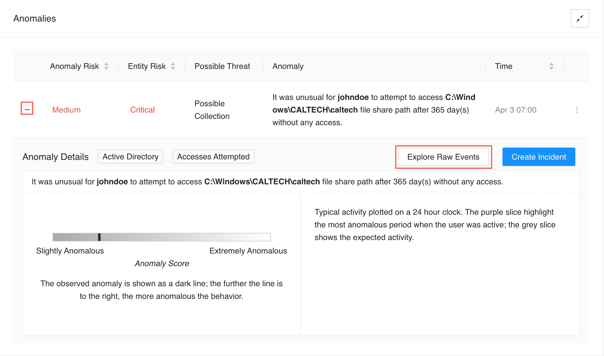
View the anomaly details, including visualization and additional description, by expanding an anomaly with the Expand (
) button.
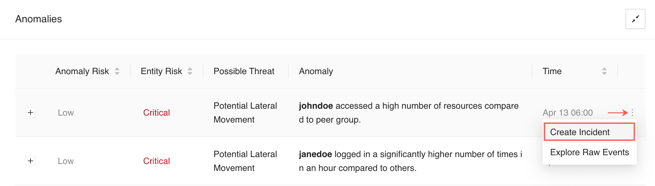
Create incidents and explore raw events from the More (
) menu.
Anomalies Panel
Go to UEBA from the navigation bar and click an entity tab.
Hover over the More (![]() ) menu and click Create Incident.
) menu and click Create Incident.
Creating Incident From the More Menu
Or, click the Expand (![]() ) button of an anamoly and click Create Incident.
) button of an anamoly and click Create Incident.
Creating Incident by Expanding an Anomaly
UEBA provides Incident name, Description and Risk level by default based on the anomaly. However, you can update these fields if required.
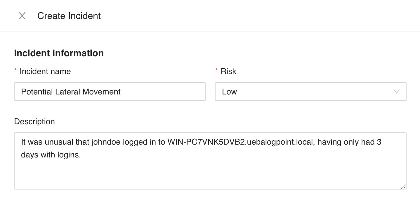
Configuring Incident Information
In Assigned to, select a user to assign the ownership of the incident. The drop-down displays all the distinct Users mapped to the Incident User Groups.
In Manageable by, select a group or groups to assign who can manage the incident. The tree node structure displays all the Incident User Groups with their corresponding users.
Users selected in both Assigned to and Manageable by can view the generated incident, reassign it, and comment on the data. However, only the Assigned to user can resolve it.
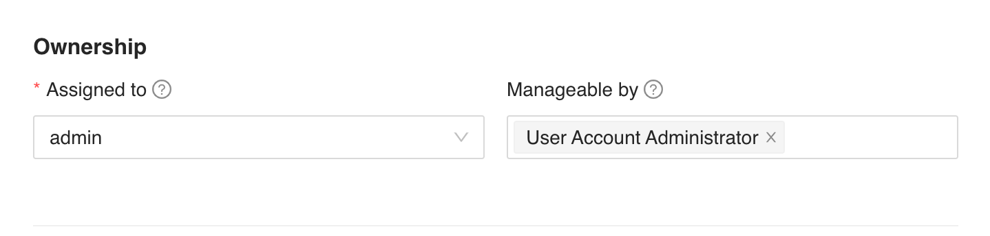
Configuring Ownership Information
While creating the incident, you can only see Assigned to and Manageable by if you belong to an Incident User Groups. In this case, you are assigned to the generated incident, and you are responsible for managing it.
You can also assign an incident to yourself and select none of the Incident User Groups in Manageable by.
Select Attack Tag, and enter Metadata and Log Sources.
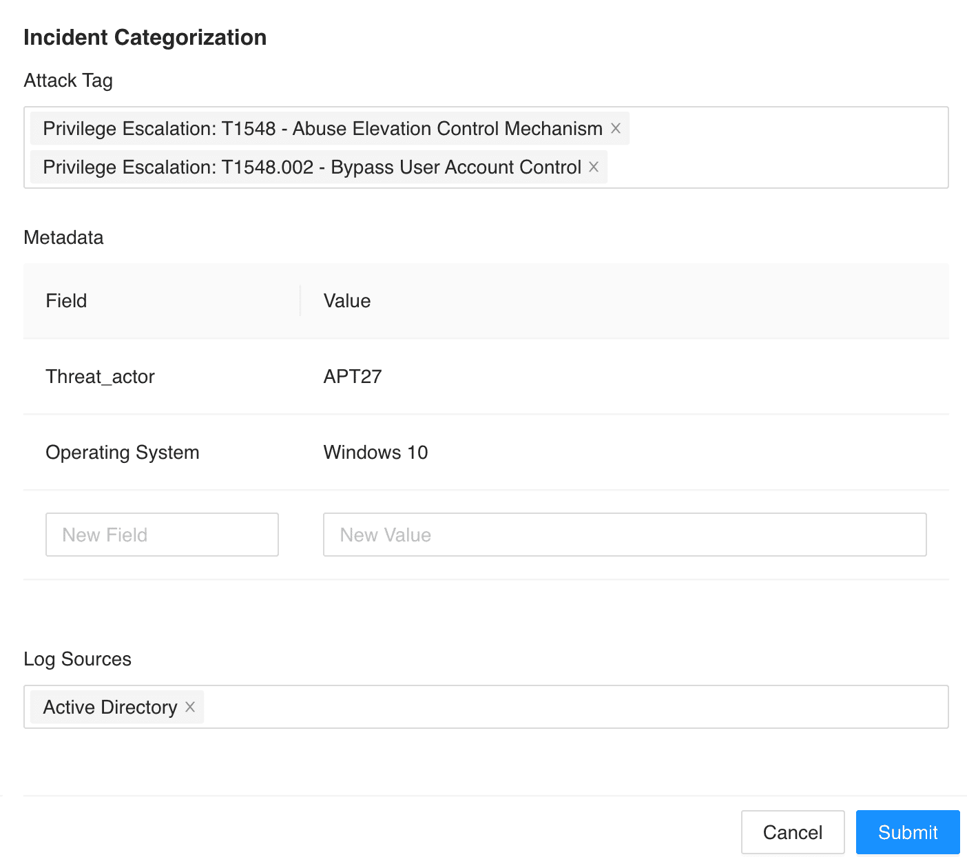
Configuring Incident Categorization
Click Submit.
For more details, see the Alerts and Incidents guide.
You can explore the raw events that triggered the anomaly by clicking Explore Raw Events. The link redirects you to LogPoint’s search page where you can further explore the event. You can view the latest risk score and entity type of the anomalous entities as an enriched data in the raw event logs.
You can explore raw events in two ways:
Hover over the More (![]() ) menu and click Explore Raw Events.
) menu and click Explore Raw Events.
Exploring Raw Events From the More Menu
Click the Expand (![]() ) button of an anamoly and click Explore Raw Events.
) button of an anamoly and click Explore Raw Events.
The enriched entity type is the output of the UEBA analysis. It is different from the entity type in the Entity Selection page, which is the type of entities in the enrichment source.
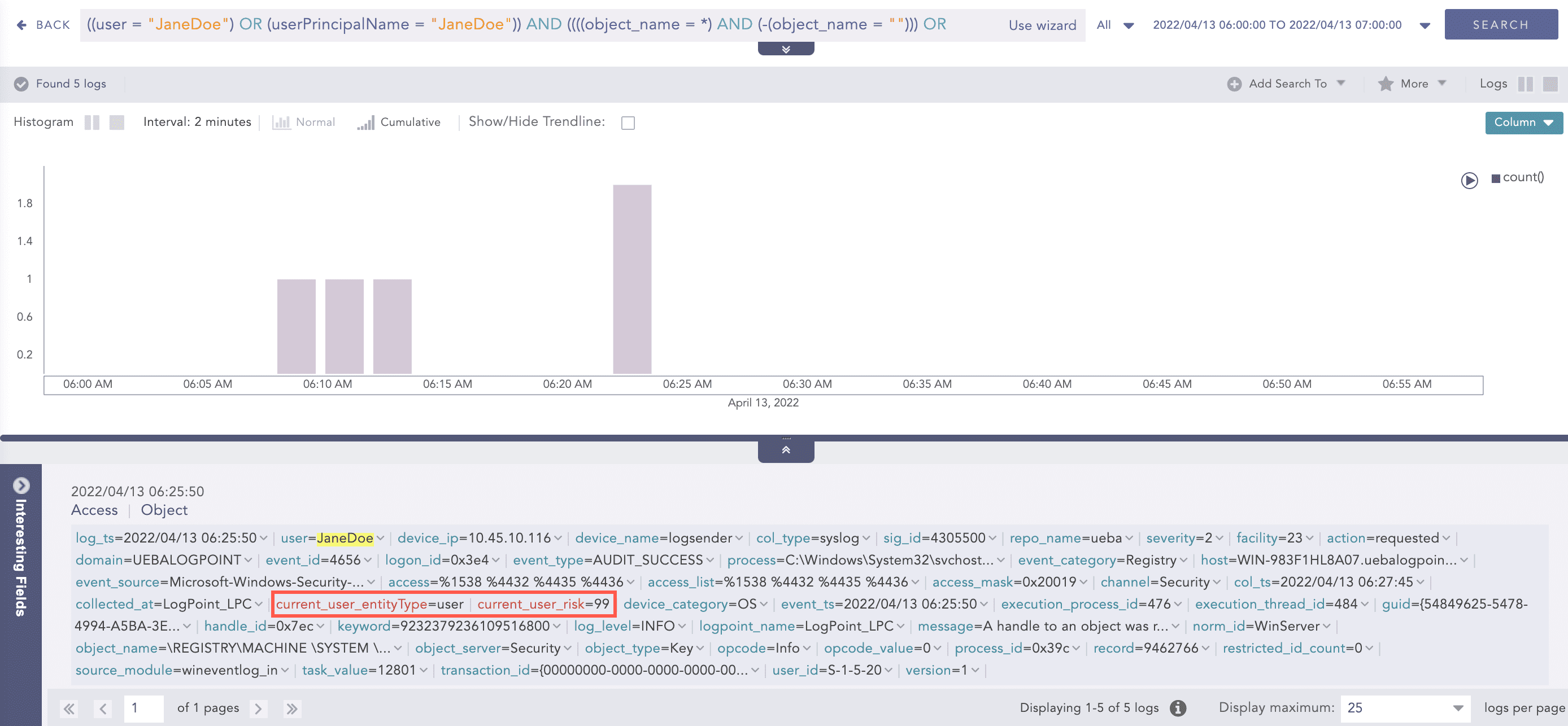
Enriched Risk Score and Entity Type in the Search Page
You can also drill back and apply filters in the UEBA page from the raw event logs. To learn more, see Going Back to the UEBA Page from the Raw Event Logs.
If the anomalies of the entities with the risk score 0 are present, UEBA displays the number of such anomalies in the Overall Risk page and its details in the Anomalies panel.
Based on the threat type, one of the following charts is displayed to visualize the anomaly:
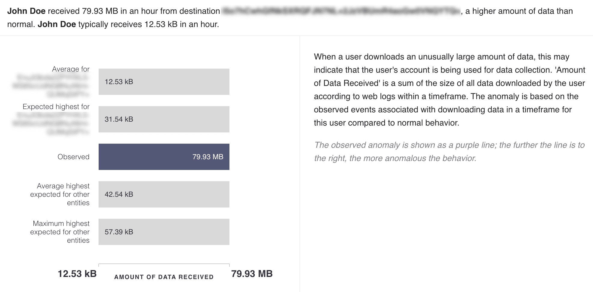
The Volumetric chart visualizes the number of times the user performed a particular anomalous activity. There are seven bars that detail:
the average number of times the user performs the particular activity
the expected highest number of times the user performs the particular activity
the observed number of times the user performed the activity
the average number of times peer users perform the activity
the expected highest number of times peer users perform the activity
the average number of times other users perform the activity
the expected highest number of times other users perform the activity
The purple bar indicates the observed anomaly.
Volumetric Chart
The anomaly highlighted by this chart is based on the number of times the user performed a particular activity in a timeframe, in comparison to the normal behavior. For example, when a user logs into a particular server an unusual number of times within an hour, this indicates a possibility of lateral movement in the system.
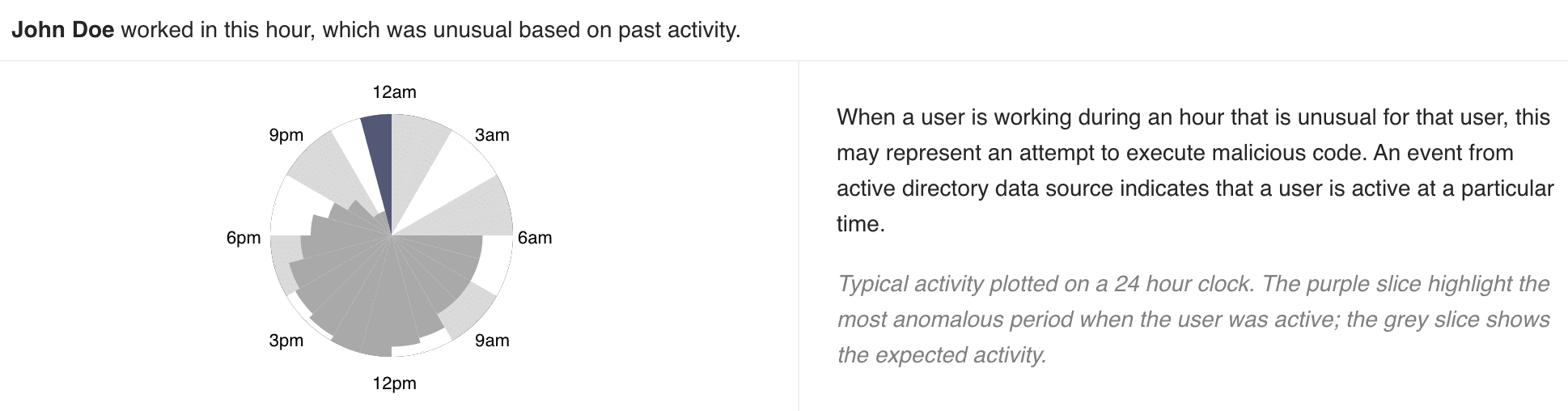
The Working Hours chart displays the activity of the user on a 24-hour clock. Each slice in the chart represents 1 hour of the time slot. The purple slice shows the most unusual time at which the user was active. The grey slices represent the expected activity on that period.
Working Hours Chart
The anomaly highlighted by this chart is based on the user’s activity at a particular time, in comparison to the past activity. For example, when a user is working on an hour they usually do not work or have never worked in the past, this may represent an account compromise or misuse.
The Rare chart highlights the anomalous activity performed by the user in a horizontal bar. The dark line in the bar represents the observed anomaly: the further the line is to the right, the more anomalous the activity is.
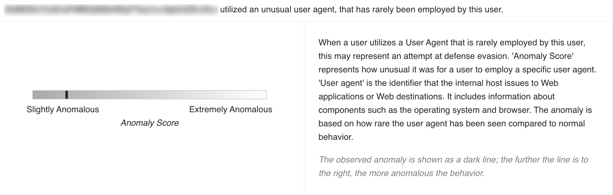
Rare Chart
The anomaly highlighted by this chart is based on the user’s activity in comparison to the rarity of the same activity performed in the past. For example, when a user, who rarely had failed access attempts on a particular shared drive, has access failures 10 times, this may indicate a compromised account.
The Rare User chart highlights how anomalous the user is, in a horizontal bar. The dark line in the bar represents the observed anomaly: the further the line is to the right, the more anomalous the user is.
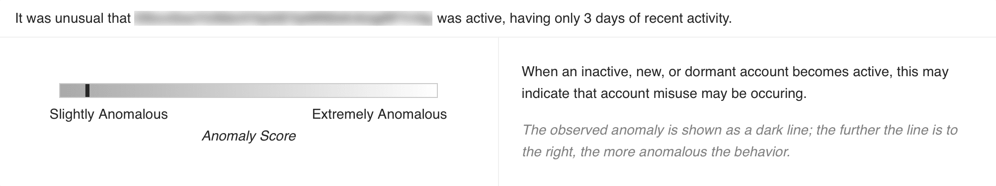
Rare User Chart
The anomaly highlighted by this chart is based on the rarity of the user’s activity compared to their normal behavior. For example, when an inactive or a new account becomes active, this may indicate an account misuse.
The Working Day chart depicts the typical weekly activity of the specific user and its peer group in a bar. The gray area in each bar highlights the activity of the user and its peer group on each weekday. A large gray area indicates a high amount of user activity for the corresponding day. The day with a dark border signifies when the anomaly was detected.
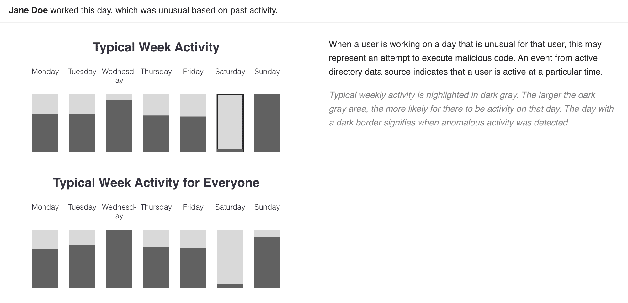
Working Day Chart
The anomaly highlighted by this chart is based on the user’s activity on a particular day of the week, in comparison to the user’s past activity as well as its peer group’s weekly activity. For example, when a user is working on a day they usually do not work or have never worked in the past, this may represent an account compromise or misuse.
The Access Ratio Cluster chart highlights the anomalous activity performed by the user in a horizontal bar and the percentage of similar peers and other users of the organization performing the activity in pie charts. The dark line in the bar represents the observed anomaly: the further the line is to the right, the more anomalous the activity is.
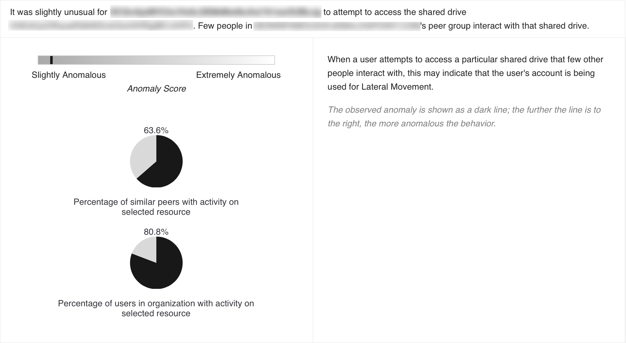
Access Ratio Cluster Chart
The anomaly highlighted by this chart is based on the user’s activity in comparison to its peer group’s activity as well as the activity of other users in the organization. For example, when a user accesses a particular shared drive that few other people interact with, this indicates a possibility of lateral movement in the system.
The Access Ratio chart highlights the anomalous activity performed by the user in a horizontal bar and the percentage of other users of the organization performing the activity in a pie chart. The dark line in the bar represents the observed anomaly: the further the line is to the right, the more anomalous the activity is.
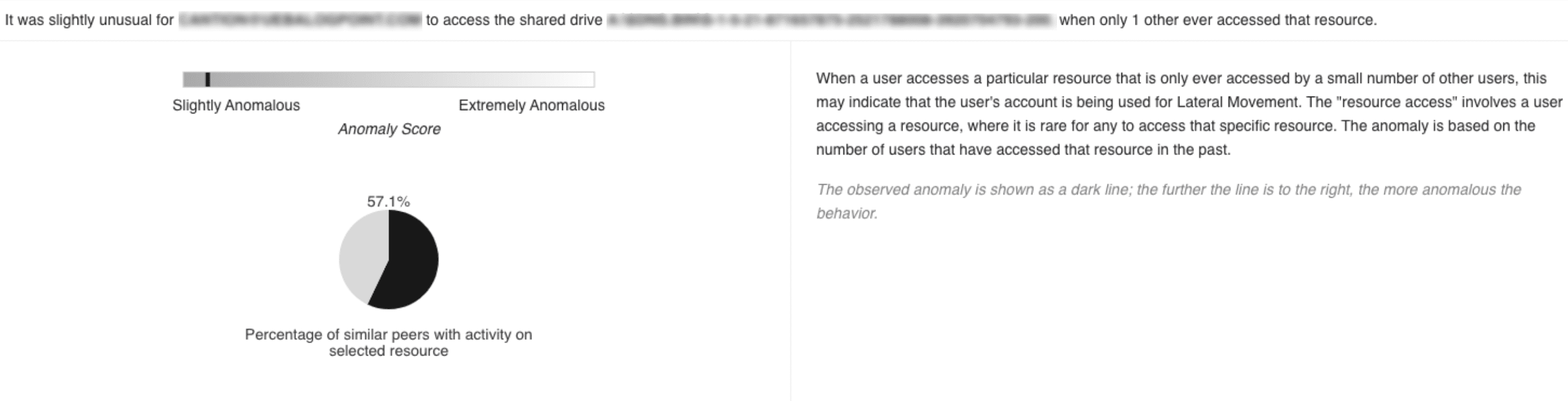
Access Ratio Chart
The anomaly highlighted by this chart is based on the user’s activity in comparison to the number of users that have performed the same activity in the past. For example, when a user accesses a particular resource that only 2 other users have accessed before, this may indicate that an attacker is using the user’s account for lateral movement.
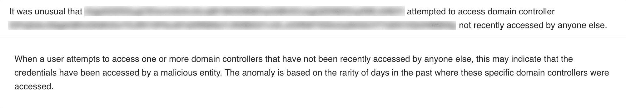
The None chart provides an additional, contextual description of the anomaly. None represents anomalies other charts do not. For example, when a user attempts to access a resource that no one has accessed recently, this may indicate that an attacker is using the user’s account for lateral movement.